
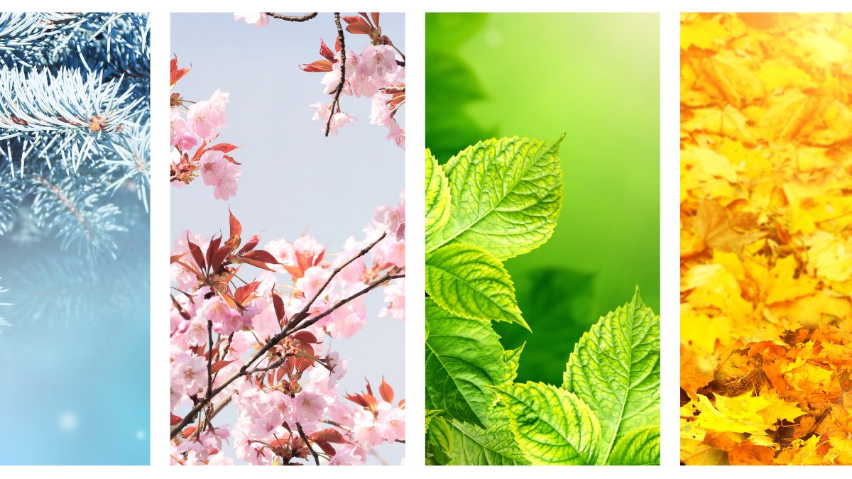
Following nature’s rhythm
When I follow the rhythm of the seasons in my colour choices, I feel more connected to nature in a very real, everyday way. Instead of forcing a mood or palette, I’m responding to what’s already happening outside—what’s blooming, fading, brightening, or resting. It makes the creative process feel more grounded and intuitive, like I’m working with nature rather than separate from it, and it brings a sense of calm because the seasons remind me that everything moves in cycles—growth, fullness, release, and renewal.
And honestly, the more I pay attention to those changes around me, the more I start to notice: tiny shifts in light, new greens appearing almost overnight, the way autumn warms everything up, or how winter reduces the world to texture and tone. It turns colour into a kind of seasonal “language” I’m constantly learning, and it makes both my art and my daily life feel more present.
The 2025 Seasonal Art Movement
The art world in 2025 is experiencing a significant shift toward seasonal collections and nature-inspired work. Current trends show that collectors are increasingly drawn to:
- Biophilic art that connects indoor spaces with natural rhythms
- Oversized botanical pieces with bold geometric interpretations
- Seasonal color palettes that reflect natural transitions
- Sustainable art practices that honor environmental themes
My Seasonal Collection Approach
Spring: Renewal and Growth

Spring palettes feel like a deep breath after winter—light, airy, and quietly hopeful. Soft blossom pinks, fresh greens, and clear sky blues create a sense of renewal and openness, like everything is starting again with a gentler kind of energy. These colours tend to feel optimistic without being loud; they invite softness, curiosity, and that “first warm day” feeling where the world suddenly looks brighter.
My spring collection focuses on emergence and new beginnings:
Key Elements:
- Dandelions: Both bloom and seed head stages, representing transformation
- Forget-me-nots: Delicate blue geometric patterns against soft backgrounds
- Color Palette: Powder blues, soft corals, fresh greens, and cream whites
- Geometric Interpretation: Circular forms with radiating patterns, pentagon flower structures
Summer: Abundance and Vibrancy

Summer colour palettes are confident, saturated, and full of movement. Bright blues, vivid pinks, crisp whites, and lively greens bring a sense of joy and momentum—sunlight on skin, long days, and the feeling that everything is in full bloom. They’re playful and energising, often pushing contrast a little higher, which makes the whole palette feel bold, social, and unmistakably alive.
My summer collections embrace bold colours and dynamic compositions:
Key Elements:
- Sunflowers: Large circular forms with geometric petal arrangements
- Poppies: Bold red geometric shapes against flowing backgrounds
- Color Palette: Vibrant oranges, deep reds, golden yellows, turquoise accents
- Geometric Interpretation: Strong vertical compositions, angular leaf patterns
Autumn: Transformation and Richness

Autumn colours feel grounding and comforting—like warmth you can wrap yourself in. Rust, burnt orange, golden yellow, and deep browns carry a sense of nostalgia and calm, with a slower, more reflective mood than summer. These palettes often feel cosy and reassuring, but also a little bittersweet: they hold that gentle reminder that change is natural, and that there’s beauty in letting things soften and fade.
My autumn work explores deeper, more complex colour relationships:
Key Elements:
- Alliums: Purple spherical forms with geometric precision
- Turning leaves: Angular interpretations of seasonal change
- Color Palette: Deep purples, golden browns, rich turquoise, warm oranges
- Geometric Interpretation: Layered compositions with complex pattern work
Winter: Simplicity and Structure

Winter palettes are quiet, minimal, and atmospheric. Icy whites, pale greys, cool blues, and muted neutrals create a feeling of stillness and space—clean, calm, and slightly introspective. There’s something restorative about winter colour: it strips everything back, makes details feel sharper, and invites a slower pace. Even when it’s cold, the palette can feel peaceful rather than harsh, like a reset for the senses.
My winter pieces focus on essential forms and stark contrasts:
Key Elements:
- Birch trees: Clean vertical lines with geometric bark patterns
- Dried grasses: Angular interpretations of winter textures
- Color Palette: Monochromatic schemes with golden accents
- Geometric Interpretation: Minimalist compositions emphasizing negative space
Creating Cohesive Seasonal Collections
1. Establish Visual Consistency
- Maintain signature geometric style across all seasons
- Use consistent compositional approaches while varying subject matter
- Apply similar scale relationships between elements
2. Develop Seasonal Color Stories
- Spring: Soft, emerging colors with high contrast accents
- Summer: Bold, saturated palettes with complementary relationships
- Autumn: Rich, complex color harmonies
- Winter: Simplified palettes with dramatic contrasts
3. Consider Market Timing
- Release seasonal collections 6-8 weeks before peak season
- Create versatile pieces that work year-round
- Develop both statement pieces and smaller works for different market segments
Technical Considerations for Seasonal Work
Color Theory Application
- Understanding seasonal psychology: How colors affect mood throughout the year
- Creating seasonal variations of successful compositions
- Balancing trendy seasonal colors with timeless appeal
Compositional Strategies
- Vertical formats for growth-oriented spring and summer pieces
- Horizontal formats for contemplative autumn and winter works
- Square formats for balanced, year-round appeal
Contemporary Context: 2025 Trends
The current art market shows strong demand for:
- Nature-inspired wall art with geometric interpretations
- Seasonal collections that allow collectors to rotate artwork
- Sustainable themes that connect with environmental consciousness
- Biophilic design elements that bring nature indoors
Building Your Seasonal Practice
Planning Your Year
- January-March: Develop spring concepts and color palettes
- April-June: Create summer collections with bold, vibrant themes
- July-September: Focus on autumn’s complex color relationships
- October-December: Explore winter’s minimalist aesthetic
Marketing Seasonal Collections
- Social media timing: Share seasonal content 4-6 weeks before season peaks
- Email marketing: Create seasonal newsletters highlighting new collections
- Product photography: Show seasonal pieces in appropriate settings
Looking Forward
As we progress through 2025, seasonal art collections continue to resonate with collectors seeking to connect their living spaces with natural rhythms. The next article in our series will explore color theory in depth, examining how to create compelling palettes that capture seasonal essence while maintaining contemporary appeal.
What seasonal elements in your local environment inspire your creative work? The key is finding the geometric patterns hidden within nature’s seasonal transformations.
- AI and Social Media
- Behind-the-scenes of Artwork Creation
- Events
- Seasonal Reflections
- Thoughts on Creativity


Leave a Reply